VISUALIZING 20 YEARS OF EVOLUTION
Background
With 20 years of experience in the design industry, CRE8 has grown from a group of pure product designers to a multi-talented team of experts in different fields providing wholistic services in not only design, but also strategic branding and engineering. We felt that our original name and logo could not represent ourselves fully anymore. We wanted to rebrand our corporate image to show how much we have evolved while keeping the core values that we stand for.

Challenges
As an established service provider, you want to be consistently recognized and remembered. That is why a rebranding work sometimes involves more risks than creating a new brand from the ground up, because you don’t want the essence to be lost and forgotten in the process. Smart integration of the old and the new became the foremost task while getting everyone on board to reach a consensus in a hyper-creative environment.

Solutions
When our teams started to go beyond doing just design, we knew that we needed a more inclusive name. By taking out the word “design”, CRE8 itself implies more possibilities and is more straightforward. Together with a bold and honest typeface, we deliver a stronger message to our clients. The logo icon is cleaner and more minimalist as we have grown to be mature and sophisticated.

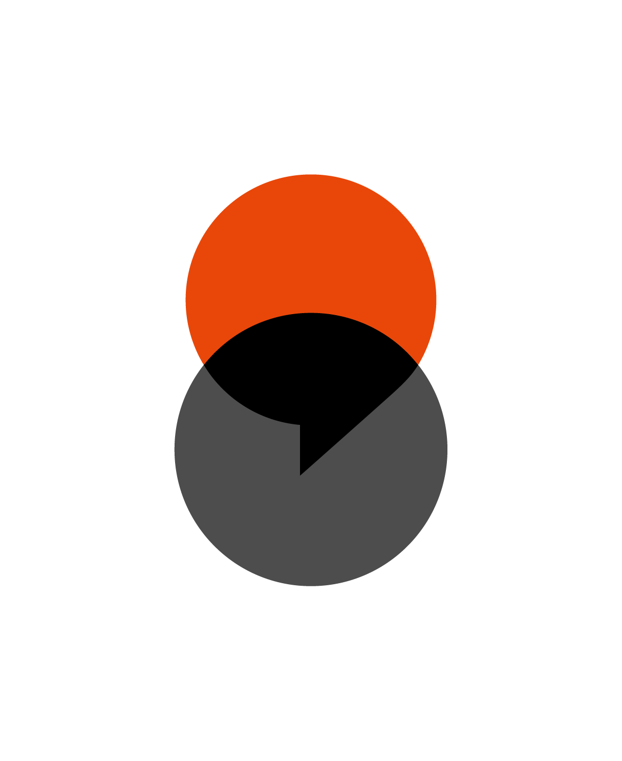
One of the major reasons that our clients like about us, is that we really listen to their needs and work collaboratively with them through all the phases. Our designers consciously chose two semi-transparent overlapping circles to embody the togetherness and flexibility; one of which is shaped like a speech balloon because we believe good design is achieved through communication. The linkage also shows that CRE8 is very versed in design for manufacturing as one circle also doubles to represent our production partners.

The orange CI color is a hint of our legacy. We keep it to remind people that while we are growing up, our core values stay the same: “Be Authentic”, and “Service like Hyatt”. Based on the enhanced logo, we redesigned the total corporate image and applied the elements to our business cards, website, and all visual collaterals.


